Look, we've all been there. This is your friendly, step-by-step roadmap to making things look real, from UVs to that final "wow" render.
Picture this: you just spent hours sculpting the perfect model. The topology is gorgeous, the silhouette is spot on. But the second you hit render? It looks like a cheap plastic toy. It's frustrating, right?
Don't sweat it. Usually, the problem isn't your talent, it's just a slightly broken PBR workflow. Let's fix that.
PBR (Physically Based Rendering) is basically just a fancy way of saying "let's make light act like it does outside." It's not a magic 'make-it-real' button, but a series of smart choices. It's about how you unwrap, which maps you pick, and how you plug them in. Get these right, and your renders stop looking like CG and start looking like actual life.
I'm going to walk you through the whole pipeline, nice and easy, using the latest Blender tools for 2026.
What is PBR Anyway? (And Why You Should Care)
In the old days, we used to fake everything with specular colors. PBR changed the game by simulating how light actually bounces off surfaces. It uses real-world data, like how rough a surface is or if it's made of metal, to make sure your material looks believable in any lighting setup.
You'll usually see two ways of doing this:
Metallic/Roughness - This is the gold standard. It's what Blender's Principled BSDF loves, and it's what you'll find on sites like Poly Haven. We'll be sticking to this.
Specular/Glossiness - The old-school way. It's still around in some legacy pipelines, but it requires a bit of math to work in Blender. Since most modern textures are Metallic/Roughness, that's where we'll focus.
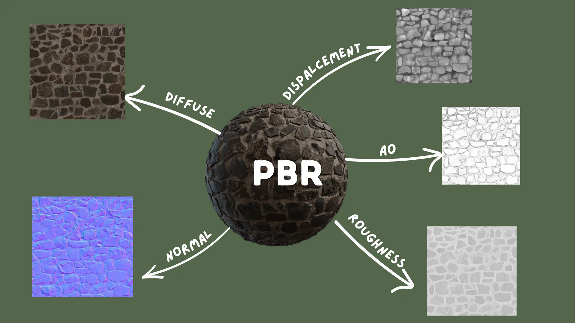
The Essential Maps
Base Color - Just the plain color, no shadows allowed!
Normal Map - That purple-ish map that fakes bumps and scratches without killing your computer.
Roughness Map - Tells Blender where to be shiny (black) and where to be matte (white).
Metallic Map - Is it metal? (White) Or is it something else? (Black).
Ambient Occlusion (AO) - Little shadows for the cracks and crevices to add "weight."
Displacement - When you want the mesh to actually move and look super realistic.
Step 1: UV Unwrapping
Don't skip this! It's the canvas for your art.
Even the best texture in the world can't save bad UVs. If your UVs are a mess, your textures will stretch and warp. Think of it like wrapping a present, you want the paper to lay flat and smooth.
Where to Cut the Seams
Hop into Edit Mode (Tab), pick your edges, and hit Mark Seam. It's just like tailoring a suit, put the seams where they won't be seen.
→ Pro Tip Always hide seams in the shadows. For characters, think armpits and behind the ears. For hard surfaces, find those sharp back edges. |
The Big Unwrap
Select everything, press U, and choose Unwrap. Blender will do the heavy lifting of flattening your mesh based on your seams.
Open the UV Editor and look for these red flags:
Stretching - Use a checker texture. If the squares look like rectangles, your UVs are stretched.
Overlaps - Keep your islands separate unless you're trying to save space on purpose.
Wasted Space - Fill that square! Use Pack Islands to keep things tidy.
Feeling Lazy? Use Smart UV Project
Look, I get it. Sometimes you just want it done. Smart UV Project is a life-saver for background props. Set the Angle Limit to around 66° and let Blender guess the seams.
It's not as clean as doing it by hand, but for something way in the back? No one will ever know.
Step 2: Your New Best Friend: The Principled BSDF
Head over to the Shading tab. That big node in the middle? That's the Principled BSDF. It's basically a superpower that handles almost everything your material needs to look real.
It's built to work perfectly with textures from any major site, so you're in good hands.
The Knobs You'll Twiddle Most
Base Color - Where the color goes.
Metallic - Is it shiny metal (1) or dull wood (0)? Avoid the middle unless you're making something weird.
Roughness - 0 for a mirror, 1 for a brick.
Normal - This needs a middle-man node (the Normal Map node) to work.
Emission Color / Strength - For glowing surfaces like screens.
Alpha - For transparent or masked geometry.
⚠ Friendly Warning Nothing in the real world is truly pure black or pure white. Even a fresh sheet of paper isn't 255 white. Keep your colors in the middle range (30 to 240) to keep them looking natural. |
Step 3: Connecting Your Texture Maps Correctly
This is where the magic happens, and where most people trip up. The secret sauce is the "Color Space" setting. Get it wrong, and your textures will look "off."
Starting Your Node Tree
In your Shader Editor, hit Shift + A and grab an Image Texture node for each map you have. It's like plugging in cables behind your TV.
Base Color / Albedo
Roughness Map
Color Space: Non-Color - This is just data telling Blender how shiny to be. If you leave it on sRGB, your model will look way too dull.
Connect Color output to Roughness on Principled BSDF.
Color Space: Non-Color - Again, just data. If you're making wood, you don't even need this, just keep the slider at zero.
Connect Color output to Metallic on Principled BSDF.
If entirely non-metallic: skip the map. Leave Metallic slider at 0.0.
Normal Map
⚠ Don't Skip This! You absolutely need a Normal Map node in the middle. If you plug the texture straight into the Principled node, your lights will act like they've lost their minds. |
Color Space: Non-Color - Essential for those fake bumps to look right.
Add a Normal Map node: Shift + A > Vector > Normal Map
Connect Image Texture Color - Normal Map Color input.
Connect Normal Map Normal output - Principled BSDF Normal input.
The Strength slider controls intensity. Start at 1.0, adjust per material.
Ambient Occlusion Map
Principled BSDF doesn't have an "AO" slot. To use it, you have to "bake" it into your color by multiplying them together. It's a classic cheat that works wonders.
Add a Mix Color node set to Multiply mode.
Connect Albedo Color + AO Color into its two inputs.
Connect output to Base Color on Principled BSDF.
Color Space: Non-Color on the AO texture node.
Actually, Cycles is so smart it usually does this for you. AO maps are mostly for extra pop or real-time engines.
Displacement / Height Map
Color Space: Non-Color.
Add Shift + A > Vector > Displacement node.
Connect Image Texture Color → Displacement Height input.
Connect Displacement Displacement output → Material Output Displacement input.
In Material Properties, set Displacement to Displacement Only or Displacement and Bump.
Add Subdivision Surface modifier + enable Adaptive Subdivision in Render Properties > Geometry.
Heads up: displacement can make your computer chug. Use it sparingly for the star of your show!
Texture Coordinate + Mapping Node (For All Maps)
Add a Texture Coordinate and a Mapping node. Connect them to every texture node. Now, when you want to change the size of your texture, you only have to change one number. Efficiency!
This gives you a single place to scale, rotate, and tile all textures at once.
Quick Reference: Map Setup
Map Type | Color Space | Connects To |
|---|
Albedo / Base Color | sRGB | Base Color |
Roughness | Non-Color | Roughness |
Metallic | Non-Color | Metallic |
Normal | Non-Color | Normal Map node → Normal |
AO | Non-Color | Multiply → Base Color |
Displacement / Height | Non-Color | Displacement node → Material Output |
Step 4: Color Management
The "Secret" to Pro Renders
You can have the best textures in the world, but if your color management is off, your render will look flat and washed out. Don't let this happen to you!
Why It Matters
Blender thinks in a perfectly straight line, but your monitor doesn't. Color management is the bridge that makes sure your screen shows the light exactly how Blender calculated it.
It prevents your bright spots from just turning into big white blobs and keeps your shadows from getting lost in the dark.
Picking the Right Look for 2026
Blender 5.0 gave us some amazing new toys. Here's the cheat sheet:
View Transform | Best For | Notes |
|---|
AgX | Most artists - archviz, product, film | Default. 16.5 stops. Replaces Filmic (deprecated). |
ACES 2.0 | ACES pipeline, DaVinci Resolve, Nuke | Neutral look, gentler highlight rolloff. |
Khronos PBR Neutral | Product photography, color-accurate output | Preserves sRGB base colors faithfully. |
Standard | Technical / diagnostic only | No tone mapping. Colors clip harshly. |
→ Just do this Use AgX. It's the best all-rounder and it's likely your default anyway. Set it and go grab a coffee. You'll find it in Render Properties. |
Exposure and Gamma
Exposure and Gamma are like filters on a camera. For most things, leave them at 0.0. If your scene is too dark, just add more actual lights, don't just crank the brightness in the settings.
Step 5: Lighting
Set the Mood
HDRI Lighting
Want instant photorealism? Use an HDRI. It's a 360 photo that lights your scene with real-world data. Switch your Shader Editor to World, add an Environment Texture, and you're done! It's the closest thing we have to a "make it look real" button.
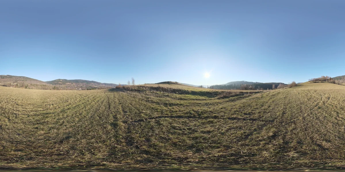
→ Free HDRIs Poly Haven is the place to go for free, high-quality HDRIs. They're a gift to the community, seriously. |
Area Lights for Control
If you want to feel like a studio photographer, use Area Lights. They act like softboxes. Remember: big light means soft shadows, small light means harsh ones. Just like in real life.
Step 6: Cycles vs. EEVEE Next
Speed vs. Beauty
Cycles
Cycles is for when you want things to look perfect. It simulates real light rays, which means gorgeous shadows and reflections. It just takes a little longer to "cook."
Pro tip: set your Noise Threshold to 0.01 for a clean final render. It's the sweet spot for most projects.
→ Use Cycles for: Final-quality output, hero assets, film and archviz work. |
EEVEE Next
EEVEE Next is incredibly fast. With raytracing on, it looks almost as good as Cycles but works in real-time. It's amazing for tinkering and getting your materials just right before committing to a long render.
→ Recommended Workflow Develop and adjust materials in EEVEE Next (fast feedback loop). Switch to Cycles only for final renders. |
Common Mistakes to Avoid
Wrong color space on data maps - Setting normal/roughness/metallic to sRGB instead of Non-Color gives incorrect results. Non-Color for all data maps, every time.
Forgetting the Normal Map node - Plugging a normal map texture directly into the Normal socket without the Normal Map node breaks normals entirely.
Pure black or pure white in base color - Real materials don’t have 0,0,0 or 255,255,255 albedos. If something looks artificially flat or bright, check your albedo values.
Leaving Filmic as your view transform - Filmic is deprecated. Switch to AgX for better saturated color handling.
Displacement without enough geometry - Displacement needs vertices to push. Unsubdivided low-poly meshes won’t visibly deform. Use Subdivision Surface modifier or Adaptive Subdivision.
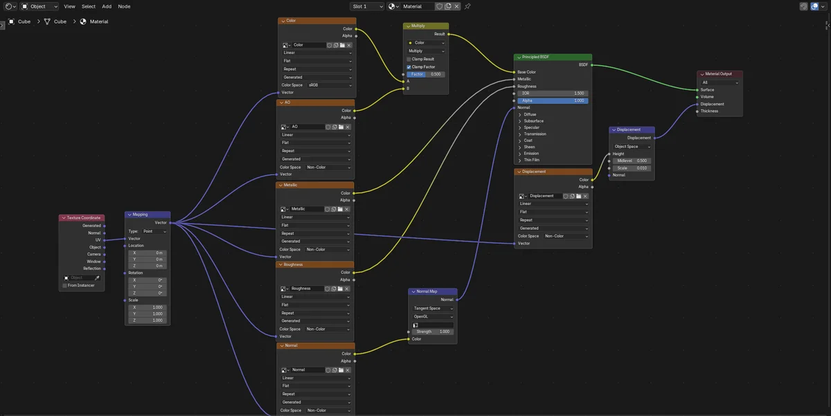
Quick Reference: The Full Node Setup
Here’s the complete connection map for a standard PBR material:
Wrapping Up
PBR isn't some scary math problem, it's just about being precise. Once you get these steps down, you won't even have to think about them. You'll stop worrying about how to make it work and start focusing on the art.
The best part of a solid PBR workflow? Your materials will look great no matter where you put them. Change the time of day, swap the environment, it doesn't matter. They'll just work. And that's what makes a render look truly professional.
Learn it once, and every render you make from now on will look ten times better. You've got this!
Look, we've all been there. This is your friendly, step-by-step roadmap to making things look real, from UVs to that final "wow" render.
Picture this: you just spent hours sculpting the perfect model. The topology is gorgeous, the silhouette is spot on. But the second you hit render? It looks like a cheap plastic toy. It's frustrating, right?
Don't sweat it. Usually, the problem isn't your talent, it's just a slightly broken PBR workflow. Let's fix that.
PBR (Physically Based Rendering) is basically just a fancy way of saying "let's make light act like it does outside." It's not a magic 'make-it-real' button, but a series of smart choices. It's about how you unwrap, which maps you pick, and how you plug them in. Get these right, and your renders stop looking like CG and start looking like actual life.
I'm going to walk you through the whole pipeline, nice and easy, using the latest Blender tools for 2026.
What is PBR Anyway? (And Why You Should Care)
In the old days, we used to fake everything with specular colors. PBR changed the game by simulating how light actually bounces off surfaces. It uses real-world data, like how rough a surface is or if it's made of metal, to make sure your material looks believable in any lighting setup.
You'll usually see two ways of doing this:
Metallic/Roughness - This is the gold standard. It's what Blender's Principled BSDF loves, and it's what you'll find on sites like Poly Haven. We'll be sticking to this.
Specular/Glossiness - The old-school way. It's still around in some legacy pipelines, but it requires a bit of math to work in Blender. Since most modern textures are Metallic/Roughness, that's where we'll focus.
The Essential Maps
Base Color - Just the plain color, no shadows allowed!
Normal Map - That purple-ish map that fakes bumps and scratches without killing your computer.
Roughness Map - Tells Blender where to be shiny (black) and where to be matte (white).
Metallic Map - Is it metal? (White) Or is it something else? (Black).
Ambient Occlusion (AO) - Little shadows for the cracks and crevices to add "weight."
Displacement - When you want the mesh to actually move and look super realistic.
Step 1: UV Unwrapping
Don't skip this! It's the canvas for your art.
Even the best texture in the world can't save bad UVs. If your UVs are a mess, your textures will stretch and warp. Think of it like wrapping a present, you want the paper to lay flat and smooth.
Where to Cut the Seams
Hop into Edit Mode (Tab), pick your edges, and hit Mark Seam. It's just like tailoring a suit, put the seams where they won't be seen.
→ Pro Tip
Always hide seams in the shadows. For characters, think armpits and behind the ears. For hard surfaces, find those sharp back edges.
The Big Unwrap
Select everything, press U, and choose Unwrap. Blender will do the heavy lifting of flattening your mesh based on your seams.
Open the UV Editor and look for these red flags:
Stretching - Use a checker texture. If the squares look like rectangles, your UVs are stretched.
Overlaps - Keep your islands separate unless you're trying to save space on purpose.
Wasted Space - Fill that square! Use Pack Islands to keep things tidy.
Feeling Lazy? Use Smart UV Project
Look, I get it. Sometimes you just want it done. Smart UV Project is a life-saver for background props. Set the Angle Limit to around 66° and let Blender guess the seams.
It's not as clean as doing it by hand, but for something way in the back? No one will ever know.
Step 2: Your New Best Friend: The Principled BSDF
Head over to the Shading tab. That big node in the middle? That's the Principled BSDF. It's basically a superpower that handles almost everything your material needs to look real.
It's built to work perfectly with textures from any major site, so you're in good hands.
The Knobs You'll Twiddle Most
Base Color - Where the color goes.
Metallic - Is it shiny metal (1) or dull wood (0)? Avoid the middle unless you're making something weird.
Roughness - 0 for a mirror, 1 for a brick.
Normal - This needs a middle-man node (the Normal Map node) to work.
Emission Color / Strength - For glowing surfaces like screens.
Alpha - For transparent or masked geometry.
⚠ Friendly Warning
Nothing in the real world is truly pure black or pure white. Even a fresh sheet of paper isn't 255 white. Keep your colors in the middle range (30 to 240) to keep them looking natural.
Step 3: Connecting Your Texture Maps Correctly
This is where the magic happens, and where most people trip up. The secret sauce is the "Color Space" setting. Get it wrong, and your textures will look "off."
Starting Your Node Tree
In your Shader Editor, hit Shift + A and grab an Image Texture node for each map you have. It's like plugging in cables behind your TV.
Base Color / Albedo
Color Space: sRGB - This is for anything that's actually a color. Plug the Color dot into the Base Color input.
Connect the Color output to Base Color on Principled BSDF.
Roughness Map
Color Space: Non-Color - This is just data telling Blender how shiny to be. If you leave it on sRGB, your model will look way too dull.
Connect Color output to Roughness on Principled BSDF.
Metallic Map
Color Space: Non-Color - Again, just data. If you're making wood, you don't even need this, just keep the slider at zero.
Connect Color output to Metallic on Principled BSDF.
If entirely non-metallic: skip the map. Leave Metallic slider at 0.0.
Normal Map
⚠ Don't Skip This!
You absolutely need a Normal Map node in the middle. If you plug the texture straight into the Principled node, your lights will act like they've lost their minds.
Color Space: Non-Color - Essential for those fake bumps to look right.
Add a Normal Map node: Shift + A > Vector > Normal Map
Connect Image Texture Color - Normal Map Color input.
Connect Normal Map Normal output - Principled BSDF Normal input.
The Strength slider controls intensity. Start at 1.0, adjust per material.
Ambient Occlusion Map
Principled BSDF doesn't have an "AO" slot. To use it, you have to "bake" it into your color by multiplying them together. It's a classic cheat that works wonders.
Add a Mix Color node set to Multiply mode.
Connect Albedo Color + AO Color into its two inputs.
Connect output to Base Color on Principled BSDF.
Color Space: Non-Color on the AO texture node.
Actually, Cycles is so smart it usually does this for you. AO maps are mostly for extra pop or real-time engines.
Displacement / Height Map
Color Space: Non-Color.
Add Shift + A > Vector > Displacement node.
Connect Image Texture Color → Displacement Height input.
Connect Displacement Displacement output → Material Output Displacement input.
In Material Properties, set Displacement to Displacement Only or Displacement and Bump.
Add Subdivision Surface modifier + enable Adaptive Subdivision in Render Properties > Geometry.
Heads up: displacement can make your computer chug. Use it sparingly for the star of your show!
Texture Coordinate + Mapping Node (For All Maps)
Add a Texture Coordinate and a Mapping node. Connect them to every texture node. Now, when you want to change the size of your texture, you only have to change one number. Efficiency!
This gives you a single place to scale, rotate, and tile all textures at once.
Quick Reference: Map Setup
Map Type
Color Space
Connects To
Albedo / Base Color
sRGB
Base Color
Roughness
Non-Color
Roughness
Metallic
Non-Color
Metallic
Normal
Non-Color
Normal Map node → Normal
AO
Non-Color
Multiply → Base Color
Displacement / Height
Non-Color
Displacement node → Material Output
Step 4: Color Management
The "Secret" to Pro Renders
You can have the best textures in the world, but if your color management is off, your render will look flat and washed out. Don't let this happen to you!
Why It Matters
Blender thinks in a perfectly straight line, but your monitor doesn't. Color management is the bridge that makes sure your screen shows the light exactly how Blender calculated it.
It prevents your bright spots from just turning into big white blobs and keeps your shadows from getting lost in the dark.
Picking the Right Look for 2026
Blender 5.0 gave us some amazing new toys. Here's the cheat sheet:
View Transform
Best For
Notes
AgX
Most artists - archviz, product, film
Default. 16.5 stops. Replaces Filmic (deprecated).
ACES 2.0
ACES pipeline, DaVinci Resolve, Nuke
Neutral look, gentler highlight rolloff.
Khronos PBR Neutral
Product photography, color-accurate output
Preserves sRGB base colors faithfully.
Standard
Technical / diagnostic only
No tone mapping. Colors clip harshly.
→ Just do this
Use AgX. It's the best all-rounder and it's likely your default anyway. Set it and go grab a coffee. You'll find it in Render Properties.
Exposure and Gamma
Exposure and Gamma are like filters on a camera. For most things, leave them at 0.0. If your scene is too dark, just add more actual lights, don't just crank the brightness in the settings.
Step 5: Lighting
Set the Mood
HDRI Lighting
Want instant photorealism? Use an HDRI. It's a 360 photo that lights your scene with real-world data. Switch your Shader Editor to World, add an Environment Texture, and you're done! It's the closest thing we have to a "make it look real" button.
→ Free HDRIs
Poly Haven is the place to go for free, high-quality HDRIs. They're a gift to the community, seriously.
Area Lights for Control
If you want to feel like a studio photographer, use Area Lights. They act like softboxes. Remember: big light means soft shadows, small light means harsh ones. Just like in real life.
Step 6: Cycles vs. EEVEE Next
Speed vs. Beauty
Cycles
Cycles is for when you want things to look perfect. It simulates real light rays, which means gorgeous shadows and reflections. It just takes a little longer to "cook."
Pro tip: set your Noise Threshold to 0.01 for a clean final render. It's the sweet spot for most projects.
→ Use Cycles for:
Final-quality output, hero assets, film and archviz work.
EEVEE Next
EEVEE Next is incredibly fast. With raytracing on, it looks almost as good as Cycles but works in real-time. It's amazing for tinkering and getting your materials just right before committing to a long render.
→ Recommended Workflow
Develop and adjust materials in EEVEE Next (fast feedback loop). Switch to Cycles only for final renders.
Common Mistakes to Avoid
Wrong color space on data maps - Setting normal/roughness/metallic to sRGB instead of Non-Color gives incorrect results. Non-Color for all data maps, every time.
Forgetting the Normal Map node - Plugging a normal map texture directly into the Normal socket without the Normal Map node breaks normals entirely.
Pure black or pure white in base color - Real materials don’t have 0,0,0 or 255,255,255 albedos. If something looks artificially flat or bright, check your albedo values.
Leaving Filmic as your view transform - Filmic is deprecated. Switch to AgX for better saturated color handling.
Displacement without enough geometry - Displacement needs vertices to push. Unsubdivided low-poly meshes won’t visibly deform. Use Subdivision Surface modifier or Adaptive Subdivision.
Quick Reference: The Full Node Setup
Here’s the complete connection map for a standard PBR material:
Wrapping Up
PBR isn't some scary math problem, it's just about being precise. Once you get these steps down, you won't even have to think about them. You'll stop worrying about how to make it work and start focusing on the art.
The best part of a solid PBR workflow? Your materials will look great no matter where you put them. Change the time of day, swap the environment, it doesn't matter. They'll just work. And that's what makes a render look truly professional.
Learn it once, and every render you make from now on will look ten times better. You've got this!